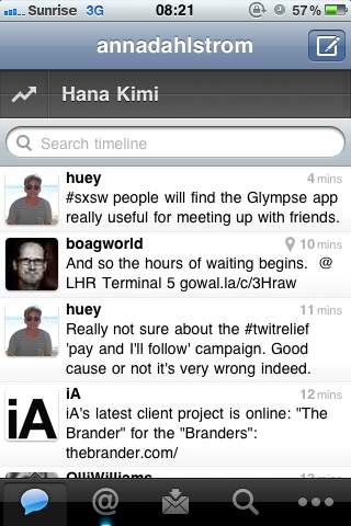
Last week Twitter released version 3.3 of their Twitter iPhone app. Some of the features are lovely and a great example of how to adapt your app according to the device. However, one new features was not great namely the quick bar which overlaps the tweet feed.
Updated made in response to Smorgasbord’s comment regarding Twitter having to implement the feature.
The “uproar” amongst the app users was enormous. People @-tweeted Twitter and used hashtags to let Twitter know that they didn’t agree with the update, at all. A poll on Mashable revealed that 81.56% of their respondents wanted the toolbar gone and Twitter responded and said they would release a new update which changed the setting. Come Wednesday this week they did and the ‘now trending’ bar has become less intrusive being positioned above the search bar and no longer overlapping tweets.
So, what can we learn from this?
1) Don’t let having to make money compromise the user experience
Twitter has to make money. Of course they do, but compromising the user experience to achieve this objective is never the solution. And just because you put something there doesn’t mean users will use it. Of course the readiness of the quick bar will make more users click on the promoted trends but that’s not a reason to introduce it in such a way that it compromises the experience of the overall app.
Monetising a service that was previously free isn’t always the easiest thing. But that also makes it even more important to ensure that it’s done in the right way.
Had Twitter introduced the quickbar feature in the format they did in the updated version the uproar would have been less, perhaps minimal, and they still would have acheived their objective of giving promoted tweets more visibility.
2) When transferring functionality implemented for a desktop/laptop browser to a mobile device revisit the objective and user priority of the functionality.
Look at if it’s a primary or secondary feature and how users use it and use this as guidance to where to position the functionality.
The primary feature of Twitter is the newsfeed and seeing the tweets of people you’ve opted in to follow. Trending topics for twitter is a secondary feature which facilitates further exploration of tweets and current conversations that are taking place. But, the user hasn’t opted in for this functionality. It is there on the sideline. It’s crucial to understand this and treat it as a secondary supplementary feature on the app version. Treating it as a feature the user has opted in to get updates on will be perceived as spamming, as the responses to version 3.3 shown.
3) Not all users are the same and mobile usage is more and more about the “I” aspect of usage.
By nature using a service for a mobile device is done on the fly. Users are using their mobiles and their apps for different things. The device is smaller and real estate more precious and because of it the “this is how I want to use the app” aspect becomes increasingly important. Users want to filter out content which they aren’t interested in. But they don’t want to do it every time they use the app. They want to get down to business (or pleasure) and access the things they are interested in straight away.
To cater for this type of usage customisation of functionality is key. Let the user decide for themselves if they want to have a feature on or off. Don’t force it on all users.
In Twitter’s case there should have been a simple setting related to the quick bar. The default option based on it being a supplementary feature should be to have it under a different view, e.g. like lists (though one could argue that lists are more and more becoming a primary filter out feature and may warrant being included in the main feed in a nifty way). But there should be an option to allow users to turn on/off seeing the bar over their newsfeed as some users will find it useful (18.44% of the people in the Mashable survey).
4) Monitor and listen to your users and respond quickly.
Twitter handled the situation brilliantly in releasing the new update so quickly. They could have been stubborn and stuck to their newly added feature saying “we like it and think it’s right”. Instead they acknowledge the error aspect and changed to make it less intrusive.
5) Don’t be afraid of trialling new things. Some will work. Some won’t.
No matter the amount of research or analysis work that’s been done sometimes you hit and miss. Though I dare say that the overlapping, intrusive quick bar would always be a miss, there are times when a new “gamble feature” just as well can prove a hit and you won’t know until you trial it by launching it.
In these instances openness is key. Inform your users of the change and ask for their feedback and, as per point 4), monitor responses and act accordingly to them. Like Twitter did.


