Facebook has yet again rolled out changes to their design and today was the first time I got the option to change to the new profile page.
Some of them are nice, like bringing in a selection of photos that you have been tagged in to the forefront of your profile page. However, some of them are less good and I’m very curious to find out why on earth Facebook has gone and carried out the following three changes:
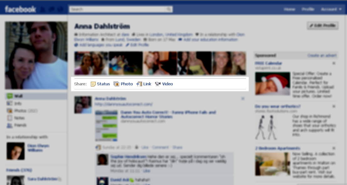
There is no longer a “share” option that is set as the default on the wall or on your profile

This means that one click is always required before the user can even start updating their status.That one click makes a difference to the experience and shouldn’t be there. Now I don’t know the stats but I would assume that one of the most frequent actions a user carries out on facebook is updating their status. Seems logical. The old profile page was set up for this and so was the wall. There was a nice entry field which allowed you to enter text and it was open by default. To welcome you and encourage you to share. For some reason Facebook’s decided to remove it. Why beats me. There is absolutely no reason for this upfront selection and my guess (or at least hope) is that they’ll soon revert back to the old approach where no click was needed.
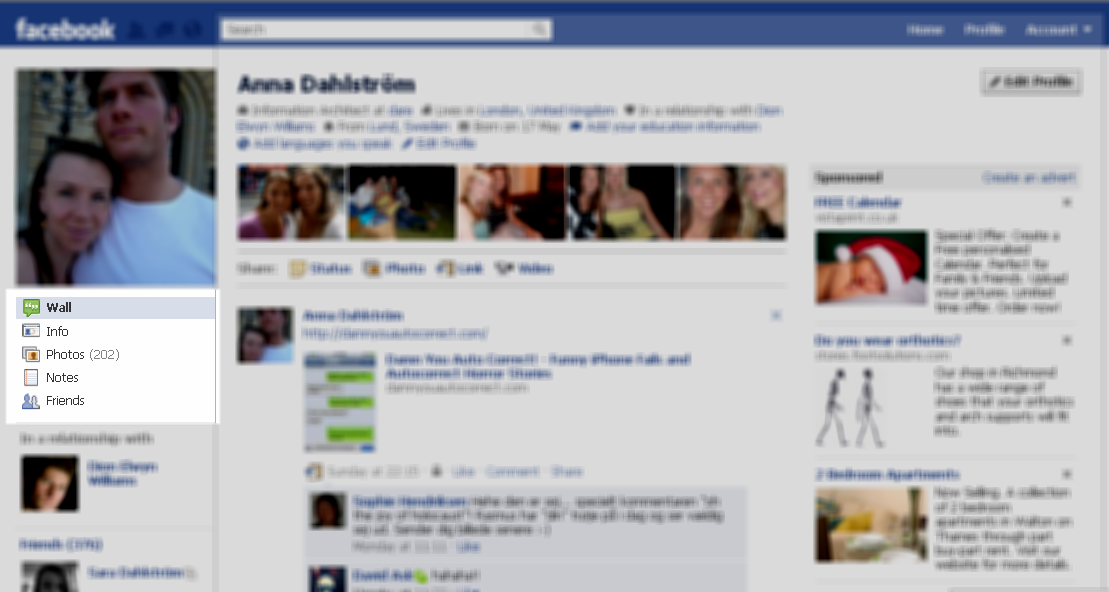
The tabbed approach to access wall, info, photos etc. has been removed and an old school left hand navigation menu has been introduced

Not only does this hide these pages somewhat more but it also makes it harder for the user to navigate between the different pages of their own/their friends’ profile pages. A user’s mouse cursor is mostly spent in the middle area of a page, which is where the tabs used to be positioned.
Additionally placing the navigator element in conjunction with the post on wall functionality facilitates going from one action to the next with as little effort as possible.
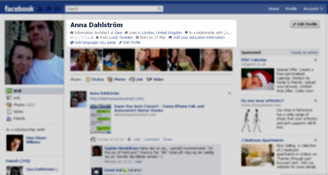
Profile information is now positioned right at the top of every profile
Now this is a funny one. It’s a nice thought as such. It’s just not very well thought through. This information remains rather static and unchanged. The profile page on Facebook is not about static and unchanged content. It’s about constant updates from the user and their friends so it’s peculiar that Facebook has chosen to give this more static and secondary type of content such a prominent place. It’s in the main content area for sodders sake. Put it under the profile picture where it belongs.
Seems Facebook forgot what the main purpose of a Facebook profile page was when they carried out their changes.
Image source: www.flickr.com/photos/pshab/498122926


