
Why we should be designing with the individual in mind
A lot has happened in the last 10 years. Multiple devices and smartphones in particular have exploded and with that how we use the web and what we expect from it has changed.
ux | work | life matters

A lot has happened in the last 10 years. Multiple devices and smartphones in particular have exploded and with that how we use the web and what we expect from it has changed.
Happiness is not something you postpone for the future; it is something you design for the present – Jim Rohn Image source: www.flickr.com/photos/aftab/3366342089

Just under a year ago I started teaching classes over at General Assembly in London. Since then I’ve taught 15 classes with them, here and in New York. Getting involved with General Assembly is one of the best things I’ve done.
Great product design doesn’t happen because of one person. It’s a team effort with everyone touching the product in some way. From the ZURblog post Designers Can Move Mountains Image source: www.flickr.com/photos/aftab/3364835006/in/photostream

When it comes to product design what we like in terms of how a product will be used and how it’s actually used can be very different. Last week I paid the price for going for wishful thinking rather than facts and the actual use case.

Today we walked across the Brooklyn Bridge and back taking us from the world of Manhattan to the world of Brooklyn. Though the views are seldom as beautiful we cross and build bridges every day in what we do.
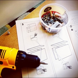
It’s just over a year since we completed project flat and today we went to Ikea, again. As always you end up with quite a few things when you leave the yellow and blue store, but today it was planned.

Yesterday I watched the Closing Ceremony on iPlayer. Though I was there in person I wanted to see what it had looked like on TV. As I sat in the sofa and watched the zoomed out view of the stadium, it reminded me of the importance of balancing the bigger

Recently I’ve come across a few people who have expressed concerns around what to call themselves and if what they do is right. They’ve looked to thought leaders and the general UX community for guidance but instead they’ve become insecure and scared.
Mobile itself is the nuts, bolts, and infrastructure, while mobility is the context which determines if it all works together or doesn’t. From the Harvard Business Review post The Future Isn’t About Mobile; It’s About Mobility Image source: www.flickr.com/photos/31878512@N06/4945216951/in/photostream

In order to do our job as IAs and UX designers properly we need not only to have good and close relationships with the teams we work with but also the clients who’s products we’re designing. Without those, selling our ideas are all the harder, no matter how good they

Tonight I held a class over at General Assembly here in London with the purpose of providing an overview of the usage patterns and UX principles you need to consider when designing for multiple devices, as well as provide some hands on experience.

The notion that you should create a separate, stripped-down version for ‘the mobile use case’ might be appropriate if such a clean mobile use case existed, but it doesn’t. […] Just because I’m on a small screen doesn’t mean I’m interested in less content or want to do less. […]
If touch is the future, the physical world is overflowing with inspiration for UI designers who are willing to simultaneously accept the limitations of “pictures under glass,” and think beyond them. From the Co.DESIGN post Using Origami To Mock-Up Ingenious Gestural Interfaces, a post about Juan Sanchez’s Interface Origami Image
I wish my friends would tell their fears to go f*** themselves and just do whatever is truly in their hearts. Whitney Hess, in a tweet Image source: www.flickr.com/photos/jdhancock/4354438814

Today I received a call from one of the charities I support. It was obvious why she was calling, but it took her 2.5 minutes of reading from a script to get to the point.

Design is built on relationships—between people mostly, but also between skillsets and knowledge areas. – Eric Schmidt, CEO Google referenced in the UX Mag article Breaking through the glass : Designing digital experiences beyond the screen Image source: www.flickr.com/photos/31878512@N06/4945216951/in/photostream

The best way for an organization to fuel higher productivity and more innovative thinking is to strongly encourage finite periods of absorbed focus, as well as shorter periods of real renewal. the Harvard Business Review article The Magic of Doing One Thing at a Time on how only doing one

An idealistic vision can lift people up and engage them, but it also needs to be approached in a way that acknowledges the reality of the challenge. Great leaders are able to work both agendas simultaneously in a compelling way. From the Harvard Business Review post The Power of Idealistic-Realism:

A great user experience is rooted in your attention to detail Apple’s iOS Human Interface Guidelines Image source: www.flickr.com/photos/funch/4679422945